Summary
As the sole designer of UC Berkeley's 2024 WSCUC accreditation report, I helped contribute towards a successful accreditation outcome.
Every 10 years, WSCUC (Western Association of Schools and Colleges Senior College and University Commission) conducts a reaccreditation process to ensure universities maintain high academic standards.
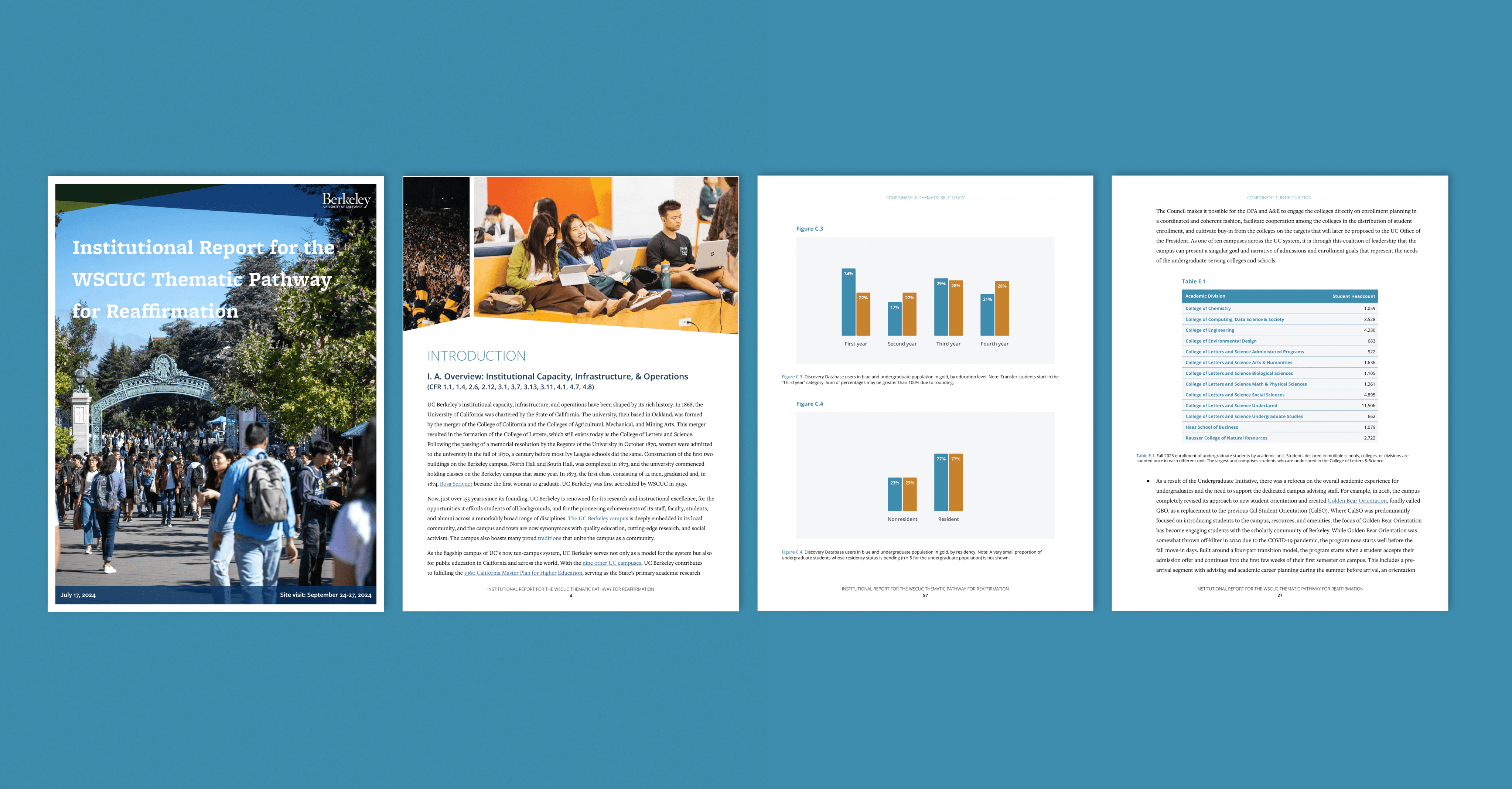
For the 2024 cycle, UC Berkeley opted to have a student design the accreditation report instead of outsourcing it to an external agency. I was selected as the sole designer, collaborating closely with university staff, campus directors, and the Chancellor to create a report that best represents university efforts through written and visual content.
Below are several snapshots of my work. You can view the full 82 page report here.


Branding
Since this report highlighted UC Berkeley's achievements and initiatives, it was essential to adhere strictly to the university's branding*.
UC Berkeley's branding offers a primary palette that taps into their iconic blue and gold colors, with a secondary palette of neutrals, vibrants, brights, and darks to complement that.
*UC Berkeley's branding changed during the summer, so branding remained on-theme to the old one.

University branding also relied on a few visual elements: structural elements, apertures, and tessellations. With the exception of structural elements, graphic elements can never be used more than once within a piece of design.
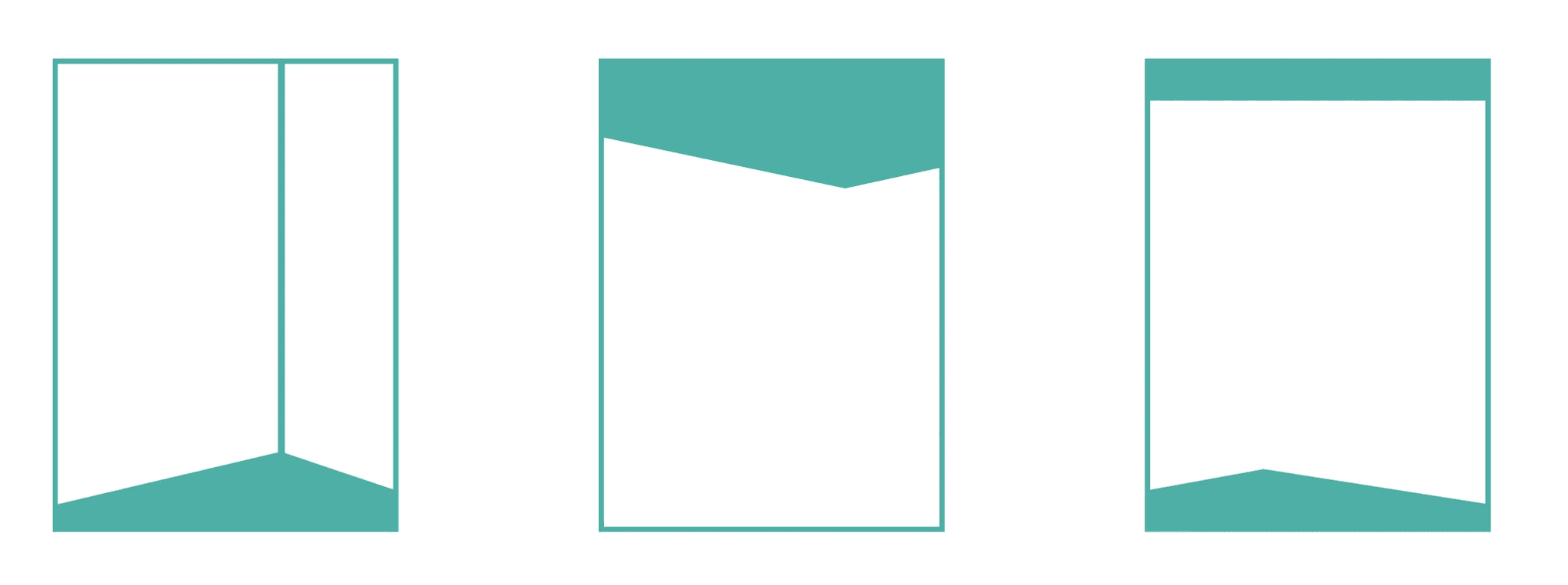
Structural elements
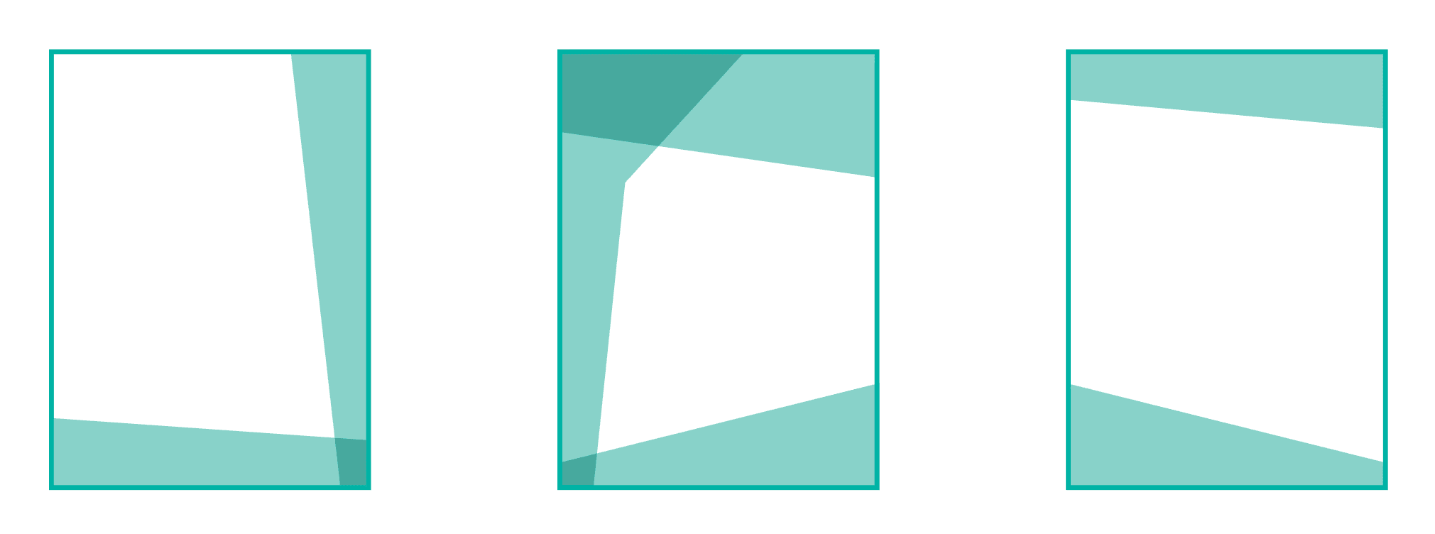
Apertures

Tessellations
Berkeley's typography primarily features the Freight family. Given the report's text-heavy nature, Open Sans was chosen for the body text.

Early Drafts
Multiple iterations were created before finalizing on a template.
Although I had a background in layout design, this was my first time designing an official report. My source of inspiration/reference derived from 2 past reports conducted by UCI for their own WSCUC report and a UC disabilities report.


First draft with 2 versions of text layouts


Alternative version
After some trial and error, it was decided that:
Visual elements would be used in a more subtle way, so the tessellations would not be used as a background image.
One column over two columns of text would be used.
Section dividers would take up half a page, rather than a whole page.
And many more design decisions…
Final Mentions
Special thanks to UED!
I'm grateful to have been referred for this role by a UED staff member, which led to both this position and a Visual Designer role with UC Berkeley UED after this project concluded. The project involved extensive collaboration and multiple revisions, but with the guidance of my supervisor, Berkeley's Communications Director, the process was both rewarding and impactful.
Interested to know more about this project? Email me at monicacortes@berkeley,edu
Similar Work
As a Visual Designer for the department, I also worked on extra reports, visualizations, and miscellaneous design projects.
You can view more work here.
Next:
Rebranding the return of a campus job fair for 30,000 students
See case study